Yambopy tutorial: band structures
This tutorial will show you how to visualise wave-function and band-structure related information, such as atomic, orbital and spin projections, following a DFT Quantum Espresso calculation using the "qepy" module of Yambopy. It also contains a section about Yambo and GW band structures.
The full tutorial, including the Quantum espresso and Yambo databases that we will read, can be downloaded and extracted from the yambo website:
wget https://media.yambo-code.eu/educational/tutorials/files/databases_qepy.tar.gz
tar -xvzf databases_qepy.tar.gz
cd databases_qepy
Tutorial 1. BN (semiconductor). Band structure
First enter in the folder
cd databases_qepy/bn-semiconductor
and have a look to the
vim plot-qe-bands.py
The qepy classes are useful both to execute Quantum Espresso and to analyze the results. Enter in the python environment, by typing python, then the full qepy library is imported by simply doing:
from qepy import *
However, for this plot we just need two classes, namely:
from qepy import Path,PwXML
Plot Band structure
The qepy class PwXML reads the data file generated by Quantum Espresso and post-processes the data. The class is instanced by doing:
xml = PwXML(prefix='bn', path='bands')
The variable prefix corresponds to the same variable of the QE input. The folder location is indicated by variable path. In order to plot the bands, we also define the k-points path (in crystal coordinates) using the function Path:
npoints = 50
path_kpoints = Path([ [[0.0, 0.0, 0.0],'$\Gamma$'],
                      [[0.5, 0.0, 0.0],'M'],
                      [[1./3,1./3,0.0],'K'],
                      [[0.0, 0.0, 0.0],'$\Gamma$']], [int(npoints*2),int(npoints),int(sqrt(5)*npoints)])
It is worth to note that the path should coincide with the selected path for the QE band calculations.
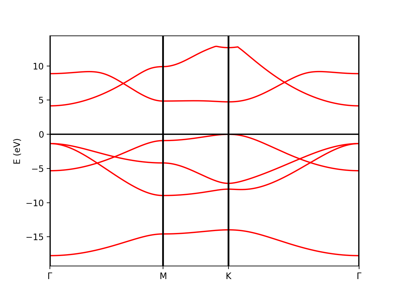
In order to show the plot we call the plot_eigen method of the PwXML class:
xml.plot_eigen(path_kpoints)
This function will automatically plot the bands as shown below running the script:
python plot-qe-bands.py
Alternatively, we can use the function plot_eigen_ax. This functions requires as input a matplotlib figure object with given axes, as you will see in the next example.
Plot atomic orbital projected Band structure
In addition to the band structure, useful information regarding the atomic orbital nature of the electronic wave functions can be displayed using the class ProjwfcXML. In order to make quantum espresso calculate the relevant data, we need to use the QE executable projwfc.x, which will create the file atomic_proj.xml. This executable projects the Kohn-Sham wavefunctions onto orthogonalized atomic orbitals, among others functionalities. The orbital indexing and ordering are explained in the input documentation of the projwfc.x function which you are invited to check (https://www.quantum-espresso.org/Doc/INPUT_PROJWFC.html#idm94). We can run projwf.x directly from the python script using the qepy class ProjwfcIn:
proj = ProjwfcIn(prefix='bn')
proj.run(folder='bands')
Be aware that this can take a while in a large system with many k-points. As in the class PwXML, we then define the path_kpoints and also the selected atomic orbitals to project our bands. We have chosen to represent the projection weight onto the nitrogen (1) and boron (2) orbitals, which can be obtained with
# Automatic selection of the states
atom_1 = band.get_states_helper(atom_query=['N'])
atom_2 = band.get_states_helper(atom_query=['B'])
The full list of orbitals is written in the file bands/prowfc.log. By inspecting it, you may also construct custom lists of states.
We have also defined the figure box
import matplotlib.pyplot as plt
fig = plt.figure(figsize=(5,7))
ax  = fig.add_axes( [ 0.12, 0.10, 0.70, 0.80 ])
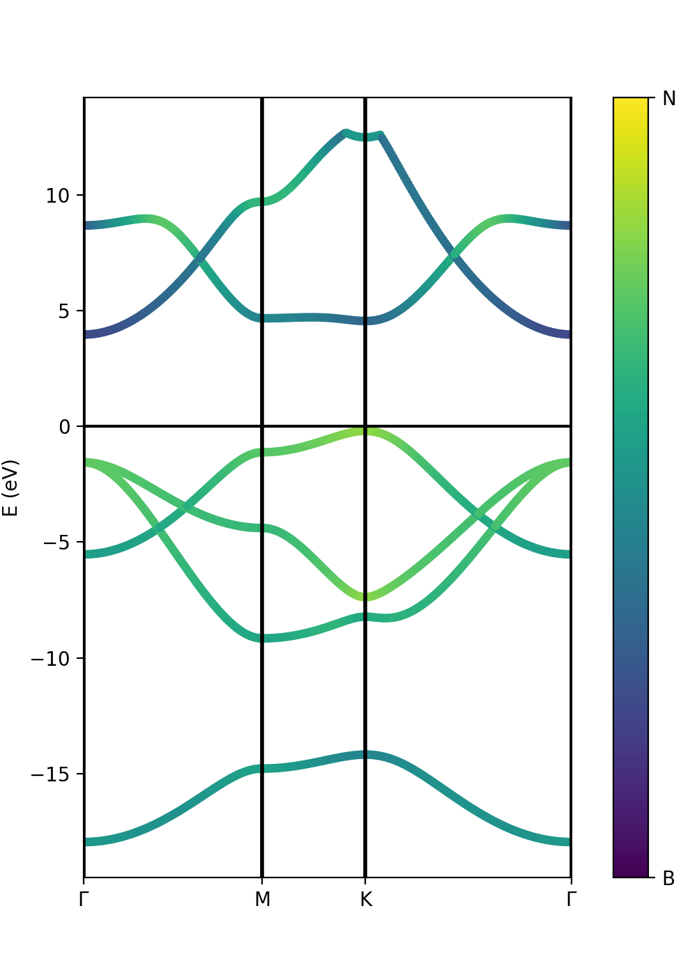
The class ProjwfcXML then runs as in this example:
band = ProjwfcXML(prefix='bn',path='bands',qe_version='7.0')
band.plot_eigen(ax,path_kpoints=path_kpoints,cmap='viridis',selected_orbitals=atom_1,selected_orbitals_2=atom_2)
We can run now the file:
python plot-qe-orbitals.py
We have chosen the colormap 'viridis' (variable cmap). You see that the colormap goes from maximum selected_orbitals content (in this case nitrogen) to the maximum selected_orbitals_2 content (in this case boron). The colormap can be represented in many ways and qepy does not include a particular function for this. An example is:
import matplotlib as mpl
cmap=plt.get_cmap('viridis')
bx  = fig.add_axes( [ 0.88, 0.10, 0.05, 0.80 ])
norm = mpl.colors.Normalize(vmin=0.,vmax=1.)
cb1 = mpl.colorbar.ColorbarBase(bx, cmap=cmap, norm=norm,orientation='vertical',ticks=[0,1])
cb1.set_ticklabels(['B', 'N'])
Suppose now that we have run the G0W0 calculation from the last tutorial, and we want to represent the atomic weights on top of the quasiparticle band structure instead of the Kohn-Sham one. However, we do not have the same kpoint grid between the G0W0 calculation and the quantum espresso "band" calculation along a path. We can then extract the parameters for a scissor operator (this is done below) and feed them to the ProjwfcXML class together with the number of valence bands. Try uncommenting the following lines in the tutorial script:
# Add scissor operator to the bands from a G0W0 calculation
scissor= [1.8985195950522469, 1.0265240811345133, 1.051588659878575]
n_val = 4
band.add_scissor(n_val,scissor)
Finally, we can also plot the band orbital character with size variation instead of a color scale. In this case we have to pass only the variable selected_orbitals (see the next tutorial).
Tutorial 2. Iron. Ferromagnetic metallic material
In the case of spin-polarized calculations we can plot the spin up and down band structures.
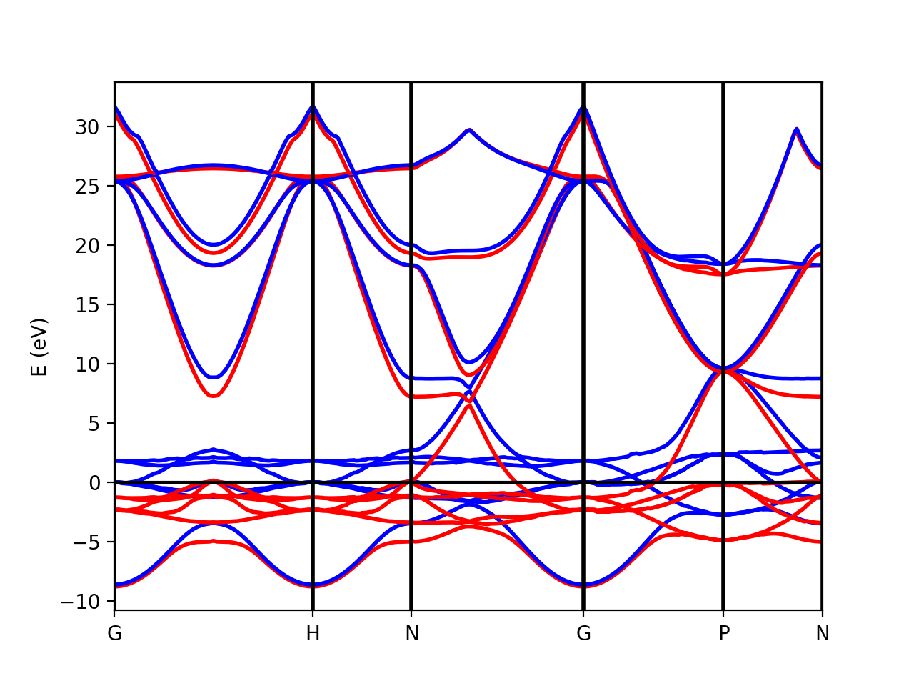
After running a band structure calculation for iron (the results are in the bands folder), we can load the data from the QE xml output files and make the band plot by running the script:
python plot-qe-bands.py
The class PwXML automatically detects the spin polarized case (nspin=2 in the QE input file). The spin up channel is displayed with red and the spin down channel with blue. In the case of iron we have selected this k-point path:
npoints = 50
path_kpoints = Path([ [[0.0, 0.0, 0.0 ],'G'],
                      [[0.0, 0.0, 1.0 ],'H'],
                      [[1./2,0.0,1./2.],'N'],
                      [[0.0, 0.0, 0.0 ],'G'],
                      [[1./2, 1./2, 1./2 ],'P'],
                      [[1./2,0.0,1./2. ],'N']], [npoints,npoints,npoints,npoints,npoints])
xml = PwXML(prefix='pw',path='bands/t0')
xml.plot_eigen(path_kpoints)
The analysis of the projected atomic orbitals is also implemented. In this case the results are more cumbersome because the projection is separated in spin up and down channels.
Let us look first at the file plot-qe-orbitals-size.
NB: If you generated your own qe band structure instead of relying on the precomputed databases, you can run the quantum espresso executable projwfc.x to compute the orbital projections using yambopy. In this case, please uncomment the following lines in the script (plot-qe-orbitals-size.py) :
#proj = ProjwfcIn(prefix='pw')
#proj.run(folder='bands')
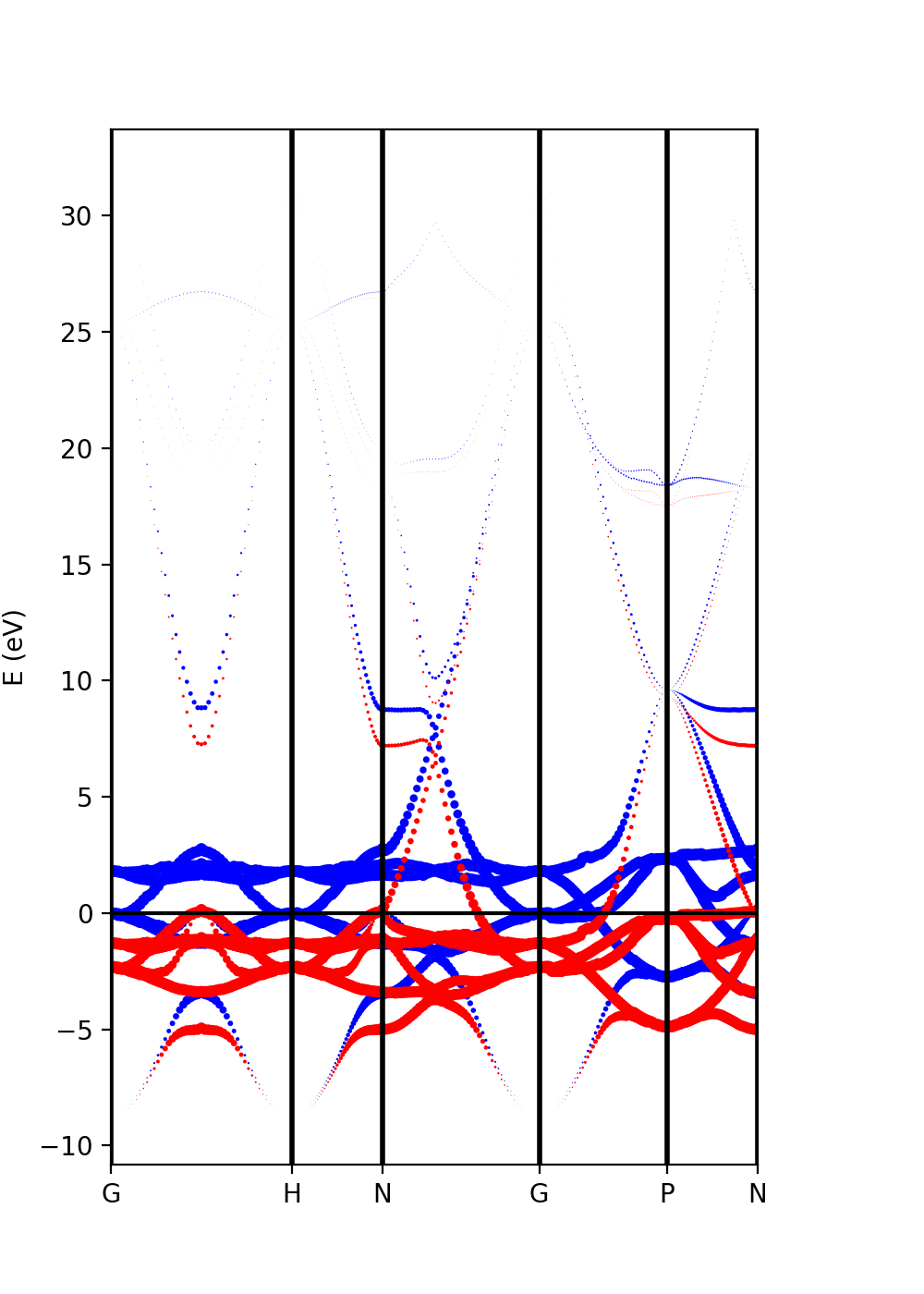
Now, we can use the dot size as a function of the weight of the orbitals
# Automatic selection of the states
s = band.get_states_helper(orbital_query=['s'])
p = band.get_states_helper(orbital_query=['p'])
d = band.get_states_helper(orbital_query=['d'])
and the plots are done with
band = ProjwfcXML(prefix='pw',path='bands',qe_version='7.0')
band.plot_eigen(ax,path_kpoints=path_kpoints,selected_orbitals=s,color='pink',color_2='black')
band.plot_eigen(ax,path_kpoints=path_kpoints,selected_orbitals=p,color='green',color_2='orange')
band.plot_eigen(ax,path_kpoints=path_kpoints,selected_orbitals=d,color='red',color_2='blue')
As an example, we can select just the d orbitals by commenting the first two plots and then running the file:
plot-qe-orbitals-size.py
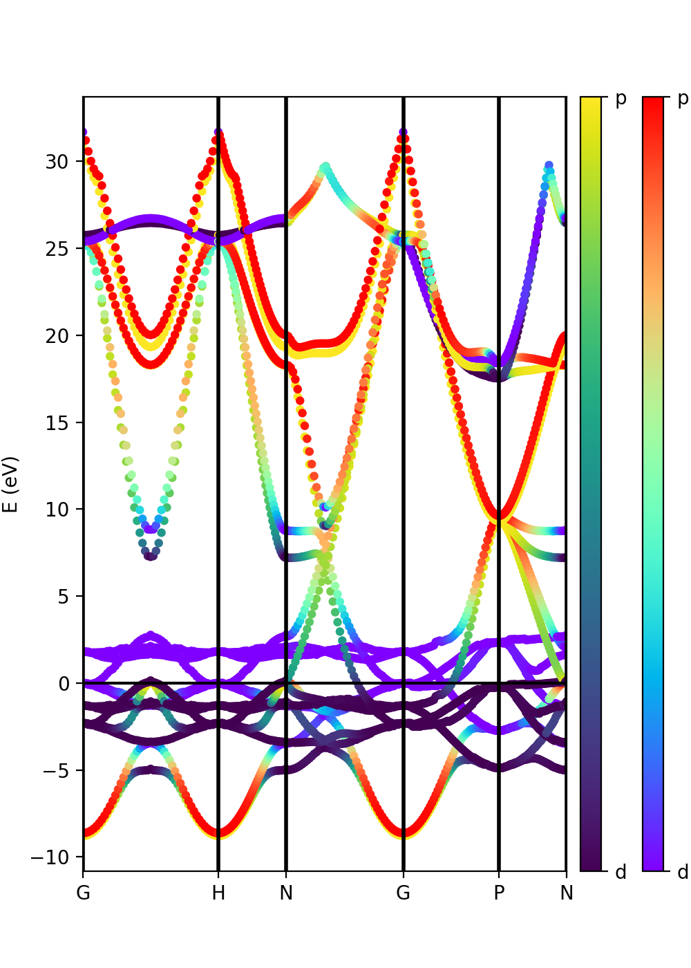
From the plot is clear that d orbitals are mainly localized around the Fermi energy. The plot above is in red and blue, while the default choice in your script should be pink and black. You can experiment with the colors and other matplotlib plot options and also plot the other orbital types.
Another option is to plot the orbital composition as a colormap running the file:
plot-qe-orbitals-colormap.py
Here we have added the p and d orbitals in the analysis:
p = band.get_states_helper(orbital_query=['p'])
d = band.get_states_helper(orbital_query=['d'])
band = ProjwfcXML(prefix='pw',path='bands',qe_version='7.0')
band.plot_eigen(ax,path_kpoints=path_kpoints,cmap='viridis',cmap2='rainbow',selected_orbitals=p,selected_orbitals_2=d)
The colormap bar is added in the same way as in Tutorial 1 (see script), but this time we have a different colormap for each spin polarisation.
Tutorial 3: GW bands
Yambopy can be used either to run Yambo and QE calculations, or to analyse the results of QE and Yambo by dealing with their generated databases. This is done with a variety of classes included in the qepy (for QE) or yambopy (for Yambo) modules. In the case of Yambo GW quasi-particle calculations, we can use the yambopy class YamboQPDB to read the database produced by the simulation. Enter in the folder
cd ../gw-bands
We can use this to find the scissor operator, plot the GW bands and to interpolate the GW bands on a smoother k-path. The example runs by typing:
python plot-qp.py
See below for an explanation of the tutorial. As usual, we can import the qepy and yambopy libraries (in addition to the standard modules we will need):
 from yambopy import YamboLatticeDB,YamboQPDB # Load yambo netcdf databases
 from qepy import Path                        # Define path in k-space
 import numpy as np
 import matplotlib.pyplot as plt
 from math import sqrt
We define the k-points path.
 npoints = 10
 path = Path([ [[  0.0,  0.0,  0.0],'$\Gamma$'],
               [[  0.5,  0.0,  0.0],'M'],
               [[1./3.,1./3.,  0.0],'K'],
               [[  0.0,  0.0,  0.0],'$\Gamma$']], [int(npoints*2),int(npoints),int(sqrt(5)*npoints)] )
Importantly, the number of points is a free choice. We can increase the variable npoints as we wish, it just means that the interpolation step will take more time. In order to analyse GW results we need to have the file related to the basic data of our Yambo calculation (SAVE/ns.db1) and the netcdf file with the quasi-particle results (ndb.QP). We load the data calling the respective classes:
# Read Lattice information from SAVE
## Note: we do not expand the kpts because QP database is in the IBZ
lat  = YamboLatticeDB.from_db_file(filename='SAVE/ns.db1',Expand=False)
# Read QP database
ydb  = YamboQPDB.from_db(filename='ndb.QP',folder='qp-gw')
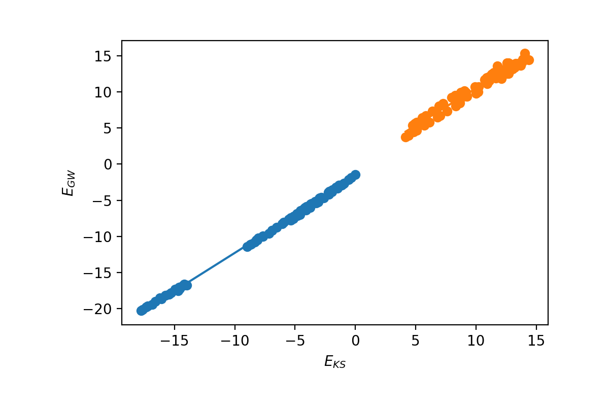
The first option is to plot the energies and calculate the ideal Kohn-Sham to GW scissor operator. We need to select the index of the top valence band:
n_top_vb = 4
ydb.plot_scissor_ax(ax,n_top_vb)
Yambopy displays the fitting and also the data of the slope of each fitting. Notice that this is also a test if the GW calculations are running well. If the dependence is not linear you should double-check your results!
In this case the slope is:
valence bands:
slope:     1.0515886598785766
conduction bands:
slope:     1.026524081134514
scissor list (shift,c,v) [eV,adim,adim]: [1.8985204833551723, 1.026524081134514, 1.0515886598785766]
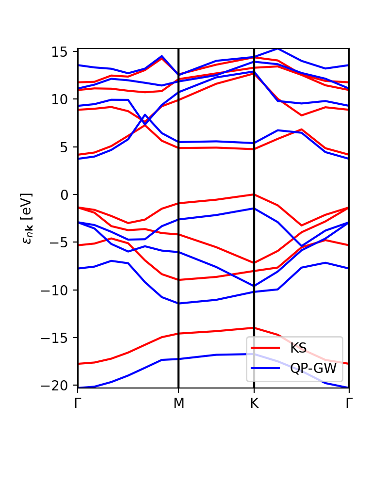
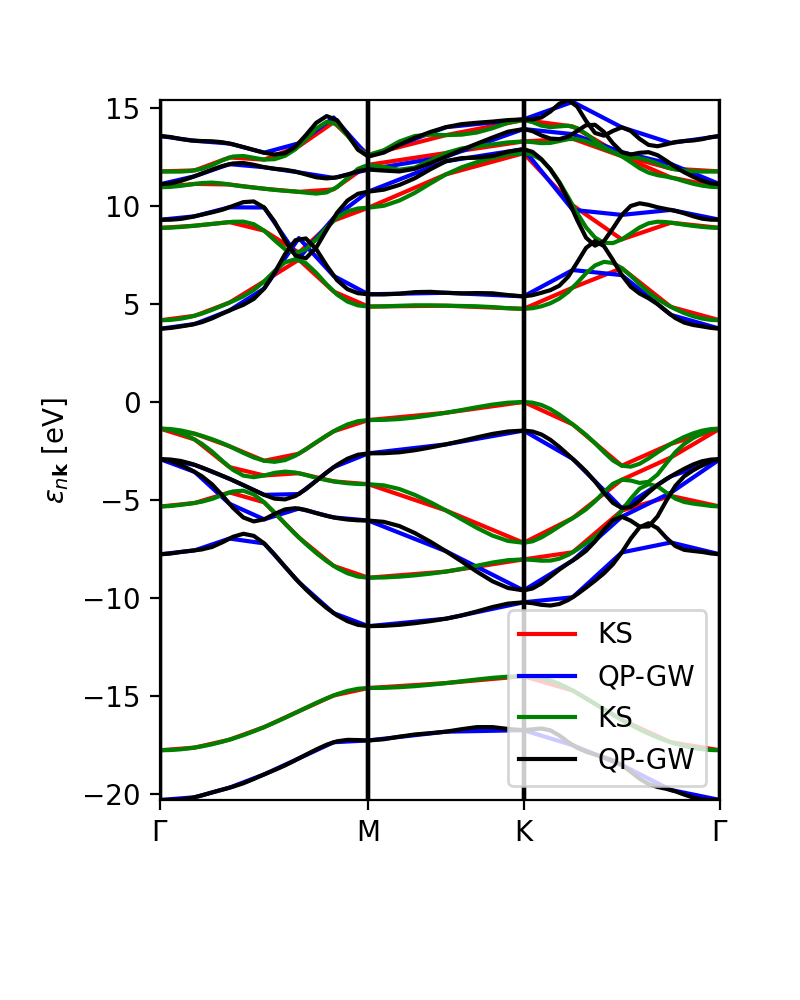
In addition to the scissor operator, we can plot the GW (and DFT) band structure along the path. The first choice would be to plot the actual GW calculations, without interpolation, to check that the results are meaningful (or not). This plot is independent of the number of k-points (npoints) that we want to put in the interpolation. The class YamboQPDB finds the calculated points that belong to the path and plots them. Be aware that if we use coarse grids the class would not find any point and the function will not work.
ks_bs_0, qp_bs_0 = ydb.get_bs_path(lat,path)
ks_bs_0.plot_ax(ax,legend=True,c_bands='r',label='KS')
qp_bs_0.plot_ax(ax,legend=True,c_bands='b',label='QP-GW')
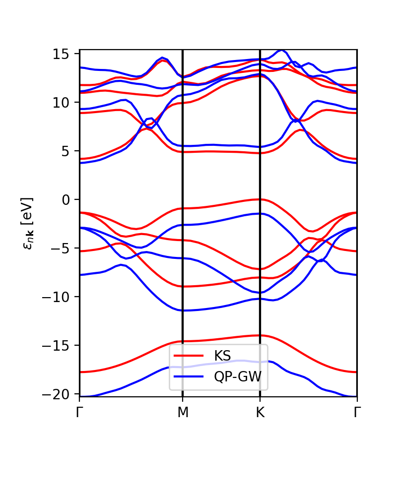
The interpolation of the DFT and GW band structures looks similar:
ks_bs, qp_bs = ydb.interpolate(lat,path,what='QP+KS',lpratio=20)
ks_bs.plot_ax(ax,legend=True,c_bands='r',label='KS')
qp_bs.plot_ax(ax,legend=True,c_bands='b',label='QP-GW')
The lpratio can be increased if the interpolation does not work as well as intended. The SKW interpolation scheme is the same on implemented in Abipy.
Finally, we can compare the calculated GW eigenvalues with the interpolation.
As always, remember that you can do your own script, the one provided is just an example.
What to do if the interpolation does not seem to work well
- First of all, you can try to modify the lpratio parameter and see if it improves.
- If it does not, often you can obtain better results by just interpolating the differences between QP and DFT energies. This can be done by first subtracting the DFT value from the QP energies, then interpolate, and finally re-add the DFT interpolated values. You can also run a separate band structure calculation in DFT on a dense grid (so that you don't need to interpolate the DFT energies) and read it into your script either with
qepyorYamboElectronsDBafter creating a SAVE directory. If you have (i) a QP calculation and SAVE on the original grid and (ii) a DFT SAVE on a denser grid, you could do this directly via theinterpolate_QP_correctionsmethod inYamboQPDB.
- If this also does not improve anything, consider that the quality of the interpolation improves the denser your actual calculated kmesh is. Thus, as a last resort, you can try to run an additional GW calculation on a shifted k-point grid. For example, you shift it by (0.5,0.5,0.5) in fractional coordinates. Yambo is able to calculate the self-energy corrections on this grid without recalculating the screening. Now, you have effectively doubled the k-density of your QP corrections. In this case, you have to do a bit of yambopy scripting yourself to merge the two databases and obtain the band plot: this is an advanced application but you can do everything with the tools yambopy makes available.
Links
- Back to Rome 2023#Tutorials
- Back to ICTP 2022#Tutorials
